Katy Eary, 2009. [photograph] Available at: http://itsmenswear.wordpress.com/2009/04/07/analysis-of-a-look-katie-eary/katieeary-awo9-1/ [Accessed 20 November 2009].
Katy Eary, 2009. [photograph] Available at: http://iamsarahyoung.com/2009/08/an-eyeful-of-eary/ [Accessed 20 November 2009].
Katy Eary, 2009. [photograph] Available at: http://iamsarahyoung.com/2009/08/an-eyeful-of-eary/ [Accessed 20 November 2009].
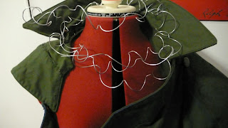
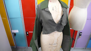
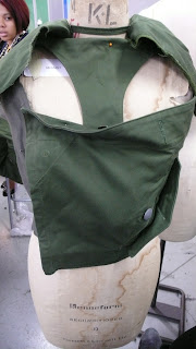
I really like this work by Katy Eary who uses military themes in an almost dark and manipulated manner. The choice of red eye make up alongside the alabaster pale foundation sets the mood of the garments well and portrays an almost cadaver like theme which ties in well with initial thoughts of war and death. The dark colours of the garment also add a sinister theme. Her designs appear to take a look at British war as she uses hats that resemble those worn by the British guard (top left image of the bottom five pictures.) I found her work inspired me when I was furthering my design with the military jacket and was the original inspiration for the use of black ink and the barbed wire neck accessory which I wanted to give a ominous feel to my work which I feel war represents. I wanted thoughts of the wire to be almost like choking the wearer and thus creating an uncomfortable feel. The top picture is also inspiring due to the use of structure and rigidity.


